Kindluse School environmental design


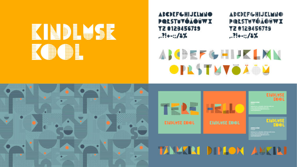
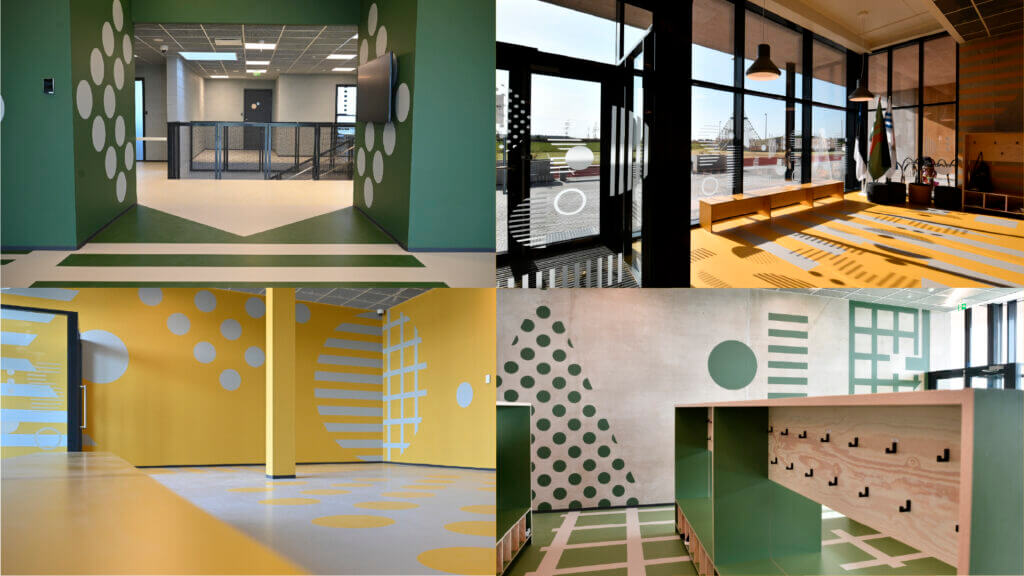
Kindluse Kool is a municipal school for children aged 7 to 16. At the heart of the school’s visual identity is a custom-designed font – an alphabet created especially for Kindluse Kool. Much like a language of its own for the school community, the alphabet marks the beginning of both the ABC book and the school journey, symbolising learning itself.
The font is constructed from geometric shapes and inspired by the familiar look of grid and lined notebooks. These recognisable forms evoke a joyful sense of familiarity, while the contemporary design language gives the font a forward-looking, optimistic character.
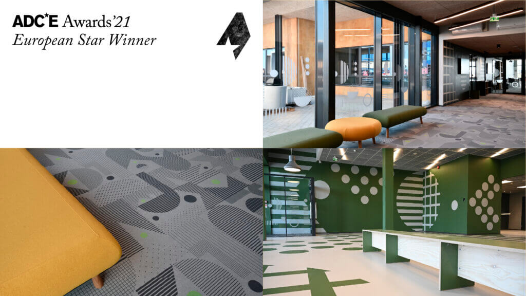
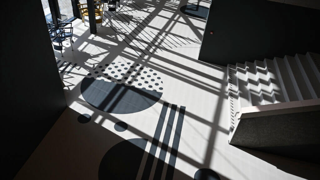
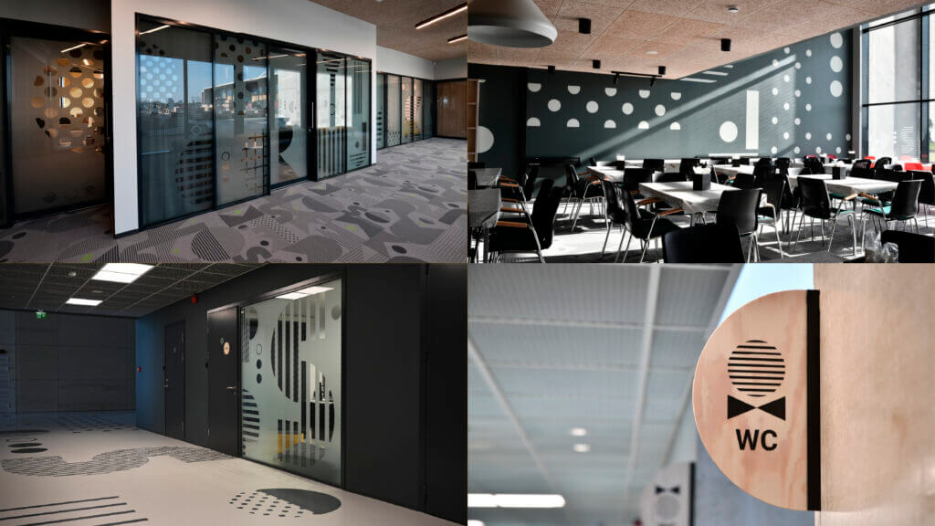
This alphabet became the foundation for all environmental graphics – from walls and carpets to signage. Different levels of the school are distinguished by different colours, creating a spatial experience that is clear, bright, and cheerful.
Kindluse Kool’s environmental design won Gold at Estonia’s Golden Egg award festival and Bronze at ADC*Europe.