
Client and Sector
Client: Butterfly — a Belgian soup brand offering 100% natural recipes made with wholesome ingredients and over 40 years of homemade culinary know-how.
Sector: Food & Beverage / Consumer Goods, with a focus on healthy, ready-to-eat products rooted in natural, clean-label formulations.
Challenge
In today’s market, unpackaged or minimally branded products are often perceived as healthier.
Butterfly needed to stand out by visually reinforcing its commitment to natural goodness — while maintaining consumer trust and shelf appeal.
Approach
.becoming developed a completely new brand identity and packaging design built around the ideas of transparency, simplicity, and natural authenticity.
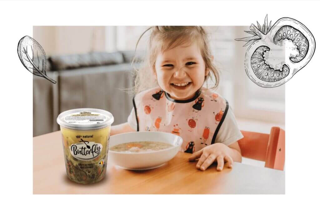
The goal: reflect the homemade, honest quality of Butterfly soups through every element of its visual identity.
Execution
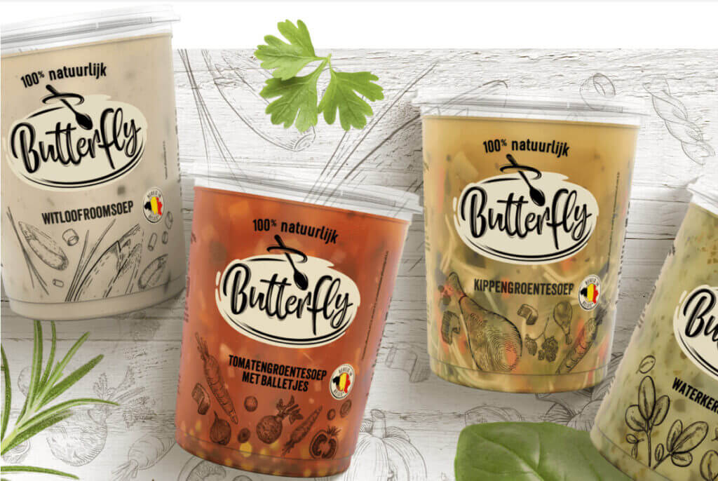
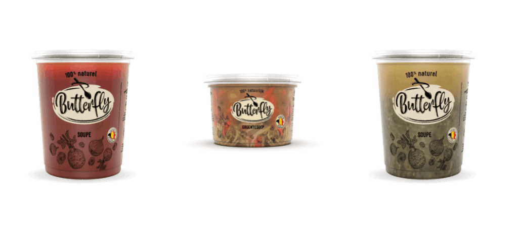
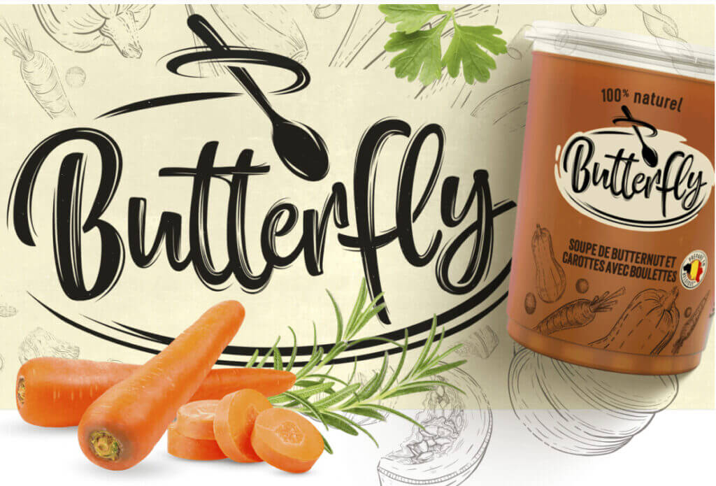
Full brand overhaul, including new logo, typography, and color palette that evoke simplicity and freshness.
Packaging was redesigned to look clean, open, and ingredient-focused — conveying health, clarity, and trust at first glance.
Visual elements were adapted across the full range to ensure strong brand consistency and long-term recognition.
Results
A visually impactful and coherent identity that aligns with the brand’s natural, healthy positioning.
Improved shelf differentiation and clarity of message, reinforcing Butterfly as a go-to choice for real, honest soups.
A future-ready brand system, designed to scale with upcoming product innovations and evolving consumer expectations.
🥇Gold Pentaward 2024